Monday, 28 November 2011

BLOCK 2: bad packaging design isn't exactly a 'bad thing'

What makes a packaging design good?
What makes a packaging design bad?

Recently i've realised that there is no real answer to these questions.

We package because we need to and how we package is up to each of us.

Package design can be:
  • simple - some customers are ''too busy'' and therefore desire packages that are simple to buy and understand.
  • of convenient quality - people want speed and convenience, without sacrificing quality.  Within a 10 - 20 seconds, shoppers make a category decision at the shelf.  It's important to understand that the quality of a package will convey the quality of the product and therefore imagery and design only have a second for success or failure.

Package designs are designed the way they are for a reason.  When designing, a strategy is required.  Packaging is one of the essential places where a strategy comes to life and forms meaning with consumers.


An example:

Packaging concept for Marlboro cigarettes.


The strategy for the packaging concept for 'Marlboro' cigarettes is to disgust and shock the target market.  'Plain Cigarette Packaging' aims to discourage the act of smoking by purposefully disturbing the consumer by visually reminding them of the effects of smoking on the packaging itself.  I have no idea if this concept has been introduced to the market, but I feel that it's the perfect example of how packaging designs can be truly horrible, but be successful -due to the set strategy. 

I plan to investigate the topic of 'cigarette packaging' in more depth, especially the threat to package them all in brown boxes.

Sunday, 27 November 2011

>>05 creating the 'Peacocks Experience'

Today our group focused on how we could alter and improve the interior layout of Peacocks stores as an attempt to improve/introduce the 'Peacocks experience'.  In order to do this properly, we identified all the issues (mostly derived from our market research) that we felt contributed to the problem.  These were as  follows:

  • the interior is inconsistent
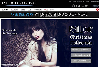
  • the website doesn't 'tie in' with the store
  • only a few stores include a 'Pearl Lowe' range 
  • the store is disorganised and cluttered
  • there are too many 'sub-brands'
  • mixed messages/mixed audiences
  • the clothing is the same quality as New Look, but it appears worse
  • window displays are crowded
  • employees don't seem to wear a uniform

In response to these problems, we then devised a number of possible solutions:

  • feature clothes more in magazines
  • introducing a Pearl Lowe line in every Peacocks store (perhaps a line of fashionable tops/dresses)
  • employees should wear clothes from the store as a method of advertising
  • introducing a 'Pearl Lowe exclusive clothing line' within department stores, such as in Debenhams or John Lewis
  • re-design the entire interior to match the website
  • ensure there are enough mirrors within the interior

The idea that I personally really believe would benefit Peacocks stores throughout the UK is the idea of creating another Pearl Lowe line as her current 'exclusive' line only features in selected stores in England.  We thought that we could add a extended range of her designs with the already-in-store boutique 'Peacocks By Design.'  We want Peacocks to really show off their clothes, and what better way to do it by having the Pearl Lowe label on more of their clothes?  We want customers to experience a positive shopping experience.


In response to all the above ideas, each member of our group created a rough interior layout of how we felt the interior should look like:


Claire's design

Lynsey's design (my design)

Jordan's design

Yasmin's design

Andy's design
After completing the task, we explained our sketches to each other before picking out the best/most appropriate parts of each design.  When doing this we then created one unified store layout example.


Within the interior space we allocated the entire left hand side of the store to women as they make up approximately 50% (the majority) of the target market.  We also created fitting rooms based on the unique circular shape of a peacock's feather.


Sketch of the fitting rooms

perspective drawing with materials

By composing a rough layout we should be able to successfully focus on window displays, appropriate wall pieces and other visuals.

Our main aim is to target a younger audience of about 18-30.  We don't want to create another typical teenage clothing store, but a mature, fashionable store.

Friday, 25 November 2011

BLOCK 2: The role of packaging

Packaging has evolved quite considerably over time.  Even the term packaging has evolved, from package (a container) to packaging (a container that has written communication about it's specific contents.)


This transformation lead to the development of 'brands' as we know them today.  Branding has grown to become the most important marketing tool in advertising.  The interesting thing is, we now live in a society that looks beyond the functional aspects of packaging to how it makes one feellook and speak.  Image has become the driving force behind packaging and branding.  Not only does it host the brand, but it entices the potential buyer through inviting graphics and excellent visuals.


I've found that leading companies such as Nike and Starbucks are brands whose packaging extends to the entire retail experience. I guess this is why these brands are so popular.  Starbucks coffee shops tend to have excellent customer service.  It's the excellent customer service combined with the experience/journey in and around the shop that contributes to it's good image.  I guess you can say that for these brands the idea of packaging goes beyond the container to the total packing of the store.  It is the packaging of the experience that allows the target audience to 'fall for' the brand.  Consumers therefore connect on a whole new level with the complete concept of packaging.


The packaging of a product needs to live up to the brand image in order to be successful.  In a book I read recently read it said that '75 percent of a purchase decision is made at the shelf'.  It also mentioned that '100 percent of your buyers see the package'.  No other form of communication can claim such impact.


What interests me is that packaging is not only a containing device for products, but it's also part of the marketing mix.  I guess it's an excellent idea of delivering the 'brand idea'.

>>04 Back to basics

Right at the beginning of this semester we were introduced to:
- Personas
- SWOT analysis
- Perception maps

...so we thought we would go right back to basics and apply these 3 strategies to our project brief: Peacocks.

Personas:


After carrying out our market research we created 6 personas that we felt summarised the types of people we surveyed.  5 out of the 6 personas are female because 90% of the people we surveyed were female.  Creating personas has helped us think about narrowing our target audience.

SWOT analysis:


To kick off strategy formulation we separated internal factors (strengths v weaknesses) from the external factors (opportunities v threats).  This procedure is what makes a SWOT analysis a powerful and appropriate tool.  When creating this SWOT analysis we were able to uncover opportunities i.e. introducing more Pearl Lowe clothing lines within Peacocks.  This is something we can exploit for Peacocks as a business.

When looking at the weaknesses of the store we were realistic.  In doing so, we were able to identify what Peacocks competitors do that Peacocks don't  (and therefore need to do).

Perception Map:

X axis: Stylish V Plain
Y axis: Expensive V Cheap

In relation to the X and Y axis, we asked a number of people to place Peacocks on the appropriate part of the perception map.  We also asked them to place Peacocks main competitors -New Look and Primark on the map. For comparisons sake we also asked them to place Topshop on the map.

The results are as follows:


The perception map illustrates that Peacocks is in the plain and cheap sector.  It's main competitor New Look is seen to be in the stylish and cheap sector.  This is the desired sector for Peacocks.  Our aim is to achieve this.


>>03 Market research

Market research was carried out in both Dundee, Scotland and Coleraine, Northern Ireland to obtain a wider set of results.


Dundee, Scotland

Coleraine, Northern Ireland

The market research consisted of the same 5 questions in both locations.  They were as follows:

  1. What do you value most in a clothes shop?
  2. What attracts you to a store?
  3. If you were looking to buy basic garments i.e. a white vest top where would you go?
  4. What do you think of Peacocks as a store?
  5. How do you rate Peacocks against New Look?
Results:

The majority of the public said that they would value the experience of a store the most.  Many others also emphasised the importance of the quality of the clothes and the value for money.  In Coleraine main street one women stated, ''Once I've had a good experience with a store I tend to visit that store every single time I'm in town''.


When asking the public what attracts them to a store they mentioned window displays and promotions.  A lady of about 60 years of age in Coleraine main street stated, ''If I'm not familiar with a store (especially when I visit bigger, busier cities) I tend to go by the window display alone to see if I spot anything I like before going into the shop!''

According to our market research, basic garments tend to be bought from Gap, New Look, Primark or Next.  This question allowed us to identify the main competitors for Peacocks, although it's important to note that not one person mentioned Peacocks as a place to purchase basic garments.

I was rather surprised with the responses from question 4.  Some people mentioned that they thought the quality of Peacocks clothing was good, others called it 'trashy' and some people said they had never been in a Peacocks store in their life.  A mother and her 2 daughters in Dundee main street stated, ''The local store is so uninviting, so we would much rather go elsewhere.''

How did people rate Peacocks against New Look!? -well someone did say that they thought New Look was 200% better...(but I guess New Look is doing well for themselves after they were rebranded and repositioned about 10 years ago!)  Some people were able to identify that the quality of the clothing was similar in both stores, however they mentioned that the clothes in Peacocks are not presented as well as in New Look -one women even described Peacocks as a 'jumble sale'.

Peacocks is obviously not anyones favourite clothes shop.  No one tends to rely on it, not even for basic clothing items.  The most positive thing we obtained about Peacocks from the market research was that the quality of the clothes were similar to that of New Look -even if they weren't presented as well .  This at least gives us something to work with.

Thursday, 24 November 2011

>>02 Peacocks store analysis


After visiting our local Peacocks store in Dundee, we soon realised that their website does not resemble their store, in any way, whatsoever.  We identified this as a major problem.


The connotations of the website are classy, fresh and professional.  Unfortunately these connotations do not transpire within the interior space of the store.


The current interior of Peacocks looks disjointed and unorganised.  When visiting the store we found that a number of different sub brands existed.  These included: 'urban style', 'e-vie', 'closer with e-vie' and 'peacocks by design'.  We were fortunate enough to get talking to the store manager who was able to tell us that Peacocks were about to get rid of the sub brand 'e-vie' and substitute it with a new sub brand called 'Peacocks with style'.  We thought this sounded like a good idea considering they varied between fonts with the 'e-vie' brand.  We weren't impressed with the inconsistency.


When we were talking to the store manager I made a point in asking about the exclusive 'Pearl Lowe' range that (according to the website) can be found in Peacocks stores.  She told us that Pearl Lowe clothing lines didn't exist in any of the Scottish Peacocks stores.  We found this disappointing.  She said the clothing lines only existed in about 25 selected stores in England, such as in the Metro Centre, Newcastle.  As the lines are exclusive, stores only receive each garment in a few sizes.  When the items are sold they are not restocked.  I guess this is what makes the clothing line 'exclusive' but I don't feel like this benefits the business.

The store manager also mentioned that a lot of women would come into the store and ask to be directed to the Pearl Lowe clothing range.  When they are told that the store doesn't stock anything from the Pearl Lowe range, customers leave feeling disappointed.  This can unfortunately give customers a negative perception of the store.

Through observation, it's obvious that the entire store is completely mixed up.  The ladies section merges directly into the young girls section, with no obvious boundary.  The same goes for the everyday clothes and the evening wear -everything is merged together.  If I'm honest, not all is bad.  Some of the clothes are actually quite nice, however this is not noticeable because they are displayed within and beside unfashionable/poorer quality clothes.

The photography within the store is really nice, however the clothes that the models are wearing are either well hidden within the store or they are not even available to buy in the store.  This is not going to successfully sell items.


I honestly believe that Peacocks have potential.  This is achievable with a fresh start. First things first, we need to differentiate their strengths from their weaknesses...    

Tuesday, 15 November 2011

>>01 Choosing a project brief

This afternoon my group met up to discuss and decide on a brief for our exam project.  The brief that we mutually agreed on was for the clothing brand 'Peacocks'.  The reason I personally wanted to do this brief was because I felt the brand had potential.  The brand however lacks continuity between the logo, the website and the interior of the store.  Something is evidently missing and I think our group will enjoy finding out what that 'something' is.

The brief:
To increase brand awareness of Peacocks and enhance Peacocks' fashion credentials, without excluding the existing 'family' customer.  This may involve using above the line marketing channels, such as devising an advertising or digital campaign, sponsorship, or through below the line marketing activity, including PR, window schemes/displays, promotions, in-store point of sale and packaging.

The brand clearly needs to be repositioned.  As part of our research we plan to visit stores such as 'F&F' at Tesco, 'George' at Asda and 'Per Una' at Marks and Spencers in order to familiarize ourselves with the competition out there.  We also plan to get a closer look at how these 3 brands have effectively/ineffectively repositioned themselves.

On our next meeting we plan to:
  • visit our local Peacocks store and conduct a site/store analysis
  • establish the main competition
  • compare the prices of garments from Peacocks to it's main competitors

Saturday, 12 November 2011

International Branding: China does KFC their own way

In week 9 of our advertising and branding module we were introduced to international Branding.


As part of the international branding lecture, we were introduced to the term 'Glocalisation'.  We were told that the word combines the words 'globalisation' and 'localisation' to emphasise the idea that a global product or service is more likely to succeed if it is adapted to the specific requirements of local practices and cultural expectations.


Within our module group we are fortunate to have exchange students from Australia and China working with us.  The Australian and Chinese students each gave a brief presentation during the lecture on aspects of advertising and branding from their own cultural background at home.


One of the chinese students shared something really interesting.  He explained that in China, chinese people prefer to eat from 'KFC' more so than 'Mcdonalds'.  They tend to eat it more regularly because they have been able to introduce chinese style foods to the menu.  Due to KFC defeating all other fast food brands for dominance in China we can find images like these:


The chinese version of KFC has tailored its menu to local tastes to cater for a larger percentage of the chinese population.  They use the same KFC symbol to generate their income.


The chinese student also told us about how China opened an outlet called ''OFC'' (Obama Fried Chicken).  The shop features the American president, Obama dressed like the KFC mascot...-I found this amusing!


The ''OFC'' logo shows a smiling and squinting President Barack Obama dressed as Colonel Sanders, the original mascot for KFC.  The Chinese phrase underneath translates ''we're so cool, aren't we?''  I thought the whole idea was hilarious, although I'm unsure how Obama has got anything to do with fried chicken.


ORIGINAL DESIGNER: Gerrit Rietveld NEW DESIGNER: Elm

As part of our third year interior environmental design course we have been in the workshop reproducing our own version of Gerrit Rietvelds's Zig Zag chair.


For this project I have been working with 2 other girls, one of which is a Dutch exchange student who studies interior and furniture design in Mechelen, Belgium.  The first letter of each of our names, Esther Lynsey and Mandy formed the group name 'Elm' -appropriate for a wood based project eh?

Gerrit Rietveld was a Dutch architect and a furniture designer.  He designed the ''Zig-Zag'' chair in 1934 using only 4 elements joined with a system of dovetailing.  The chair's visual simplicity was created using a relatively complex construction.


The design is said to be an expression of the 'De Stijl' movement and is included in the permanent collection of the Museum of Modern Art.  The chair is made of natural cherry and can serve as either a chair or a side table.

Over the past 4 weeks we have spent our Friday after noons creating our own version of the chair.  We have found the process rather mind boggling -especially when calculating the angle each piece of wood needed to be 'planed' at.

The processes that we have tackled are as follows:

-concise measuring

-using the bandsaw

-chiseling

-calculating the correct angles

-planing the wood

In order to make our version of the chair different to Rietveld's, we decided that we would make the 'leg' of the chair shorter than the leg of the original Zig-Zag chair.  We look forward to seeing the final outcome.


Advertising of Space and Place - Merchant City, Glasgow

In a recent lecture we were introduced to advertising of space and place.


In order to discover what is involved when branding a particular space, we travelled to Glasgow's city centre to explore the 'Merchant City' which was branded in mid 2003 by a company called 'Graven Images.'


The companies aim was to identify the Merchant City as Glasgow's 'cultural quarter'.  This was achieved by introducing a number of signage systems throughout the area.  These include a 10m high stainless steel sign and a trail of bronze plaques.


As a lot of the buildings within the Merchant City had history, the plaques are used to tell the stories of the buildings in the area.

I feel that branding the Merchant City has effectively created a thriving and attractive area within Glasgow's city centre.  However, I noticed that it doesn't have an 'official' periphery -perhaps this was part of the design.

On our visit we made it our intention to take note and visit a number of the stores there.  I had heard before that Merchant City was renowned for designer brands so I wasn't surprised to find stores such as Ralph Lauren, Mulberry and Radley located in this area.  The interior design of the stores were sincerely classy and unique.  In Ralph Lauren the clothes were so neatly presented that I resented picking them up in case I messed them up in any way!

-by glancing at the websites alone, and even looking at the prices -it's obvious that these are top brands.


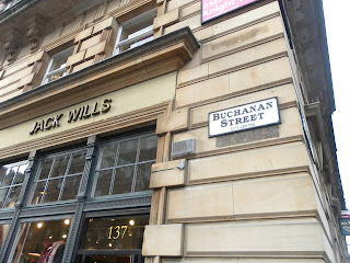
Adjacent to Merchant City is Buchanan Street -the main street in Glasgow's city centre.


My friend and I decided to take a look in 'Jack Wills' -a rather preppy university outfitters store found on Buchanan Street.  We started off looking at the different clothing ranges, however we became more fascinated with the interior of the store -I guess being interior students, this was standard behaviour!  The feel of the store could be described as 'old British country scene meets your standard living room.'  On the ground floor, the Jack Wills merchandise is found sprawled across a pool table.  The image is casual and desirable.  Most of the products around the store (such as the clothes) are seen in use, whether they're seen on mannequins or displayed in their own specific way.  In doing this, the products become more desirable to the target audience as they can then visualise wearing AND owning these items.

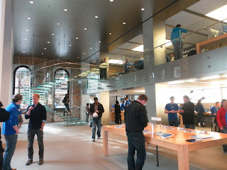
When walking down the rest of Buchanan Street, I made a point in visiting the Apple store.  It's clean slick interior makes me feel good every time.  The interior is minimalist, which really adds to the brand identity of the store.  The one thing I always notice when entering the apple store is the number of staff dispersed throughout the interior.  The combination of good customer service alongside the layout of the store, really does gives Apple it's positive brand identity.  They are inviting, and it's obvious.


I really enjoyed my day in Glasgow.  I particularly liked how Graven Images branded Merchant City.  It really does add a little something extra to Glasgow's thriving city centre.