In order to discover what is involved when branding a particular space, we travelled to Glasgow's city centre to explore the 'Merchant City' which was branded in mid 2003 by a company called 'Graven Images.'
The companies aim was to identify the Merchant City as Glasgow's 'cultural quarter'. This was achieved by introducing a number of signage systems throughout the area. These include a 10m high stainless steel sign and a trail of bronze plaques.
As a lot of the buildings within the Merchant City had history, the plaques are used to tell the stories of the buildings in the area.
I feel that branding the Merchant City has effectively created a thriving and attractive area within Glasgow's city centre. However, I noticed that it doesn't have an 'official' periphery -perhaps this was part of the design.
On our visit we made it our intention to take note and visit a number of the stores there. I had heard before that Merchant City was renowned for designer brands so I wasn't surprised to find stores such as Ralph Lauren, Mulberry and Radley located in this area. The interior design of the stores were sincerely classy and unique. In Ralph Lauren the clothes were so neatly presented that I resented picking them up in case I messed them up in any way!
-by glancing at the websites alone, and even looking at the prices -it's obvious that these are top brands.
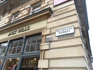
Adjacent to Merchant City is Buchanan Street -the main street in Glasgow's city centre.
My friend and I decided to take a look in 'Jack Wills' -a rather preppy university outfitters store found on Buchanan Street. We started off looking at the different clothing ranges, however we became more fascinated with the interior of the store -I guess being interior students, this was standard behaviour! The feel of the store could be described as 'old British country scene meets your standard living room.' On the ground floor, the Jack Wills merchandise is found sprawled across a pool table. The image is casual and desirable. Most of the products around the store (such as the clothes) are seen in use, whether they're seen on mannequins or displayed in their own specific way. In doing this, the products become more desirable to the target audience as they can then visualise wearing AND owning these items.
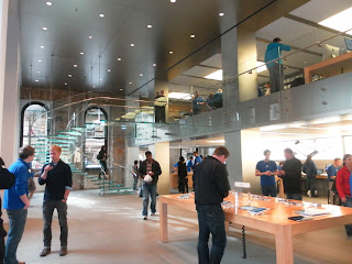
When walking down the rest of Buchanan Street, I made a point in visiting the Apple store. It's clean slick interior makes me feel good every time. The interior is minimalist, which really adds to the brand identity of the store. The one thing I always notice when entering the apple store is the number of staff dispersed throughout the interior. The combination of good customer service alongside the layout of the store, really does gives Apple it's positive brand identity. They are inviting, and it's obvious.
I really enjoyed my day in Glasgow. I particularly liked how Graven Images branded Merchant City. It really does add a little something extra to Glasgow's thriving city centre.


o0k60c9f21 l9c13s5u54 k1l00n7z75 t6d88u9q08 d7d78o3h54 o7m80h6w00
ReplyDelete