Saturday, 12 November 2011

ORIGINAL DESIGNER: Gerrit Rietveld NEW DESIGNER: Elm

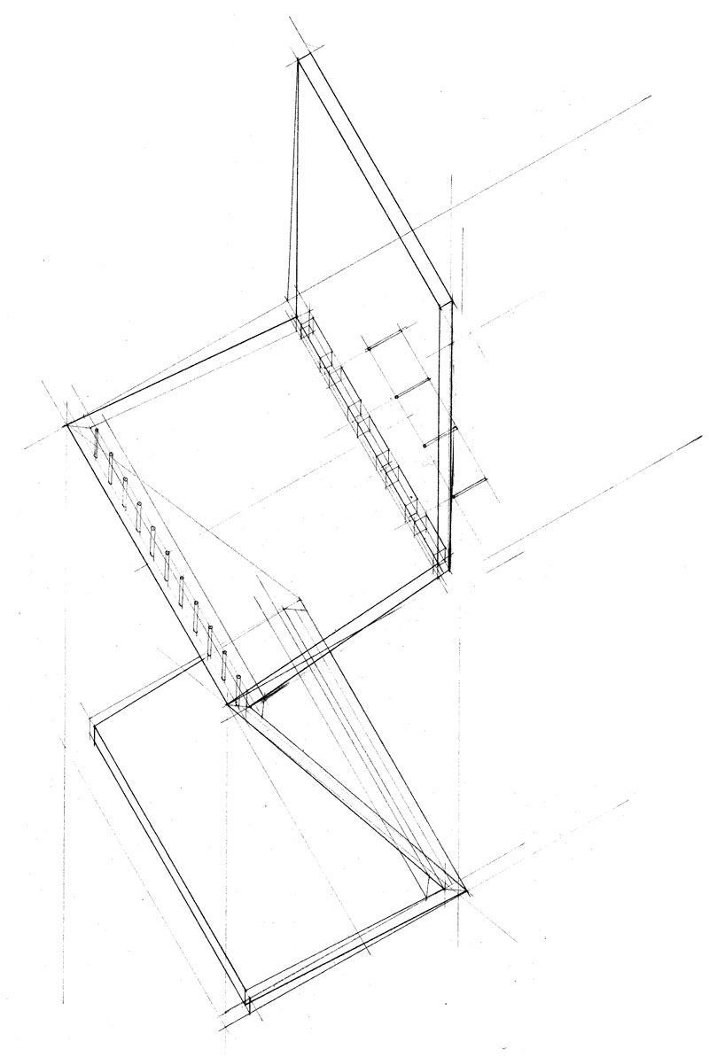
As part of our third year interior environmental design course we have been in the workshop reproducing our own version of Gerrit Rietvelds's Zig Zag chair.


For this project I have been working with 2 other girls, one of which is a Dutch exchange student who studies interior and furniture design in Mechelen, Belgium.  The first letter of each of our names, Esther Lynsey and Mandy formed the group name 'Elm' -appropriate for a wood based project eh?

Gerrit Rietveld was a Dutch architect and a furniture designer.  He designed the ''Zig-Zag'' chair in 1934 using only 4 elements joined with a system of dovetailing.  The chair's visual simplicity was created using a relatively complex construction.


The design is said to be an expression of the 'De Stijl' movement and is included in the permanent collection of the Museum of Modern Art.  The chair is made of natural cherry and can serve as either a chair or a side table.

Over the past 4 weeks we have spent our Friday after noons creating our own version of the chair.  We have found the process rather mind boggling -especially when calculating the angle each piece of wood needed to be 'planed' at.

The processes that we have tackled are as follows:

-concise measuring

-using the bandsaw

-chiseling

-calculating the correct angles

-planing the wood

In order to make our version of the chair different to Rietveld's, we decided that we would make the 'leg' of the chair shorter than the leg of the original Zig-Zag chair.  We look forward to seeing the final outcome.


Advertising of Space and Place - Merchant City, Glasgow

In a recent lecture we were introduced to advertising of space and place.


In order to discover what is involved when branding a particular space, we travelled to Glasgow's city centre to explore the 'Merchant City' which was branded in mid 2003 by a company called 'Graven Images.'


The companies aim was to identify the Merchant City as Glasgow's 'cultural quarter'.  This was achieved by introducing a number of signage systems throughout the area.  These include a 10m high stainless steel sign and a trail of bronze plaques.


As a lot of the buildings within the Merchant City had history, the plaques are used to tell the stories of the buildings in the area.

I feel that branding the Merchant City has effectively created a thriving and attractive area within Glasgow's city centre.  However, I noticed that it doesn't have an 'official' periphery -perhaps this was part of the design.

On our visit we made it our intention to take note and visit a number of the stores there.  I had heard before that Merchant City was renowned for designer brands so I wasn't surprised to find stores such as Ralph Lauren, Mulberry and Radley located in this area.  The interior design of the stores were sincerely classy and unique.  In Ralph Lauren the clothes were so neatly presented that I resented picking them up in case I messed them up in any way!

-by glancing at the websites alone, and even looking at the prices -it's obvious that these are top brands.


Adjacent to Merchant City is Buchanan Street -the main street in Glasgow's city centre.


My friend and I decided to take a look in 'Jack Wills' -a rather preppy university outfitters store found on Buchanan Street.  We started off looking at the different clothing ranges, however we became more fascinated with the interior of the store -I guess being interior students, this was standard behaviour!  The feel of the store could be described as 'old British country scene meets your standard living room.'  On the ground floor, the Jack Wills merchandise is found sprawled across a pool table.  The image is casual and desirable.  Most of the products around the store (such as the clothes) are seen in use, whether they're seen on mannequins or displayed in their own specific way.  In doing this, the products become more desirable to the target audience as they can then visualise wearing AND owning these items.

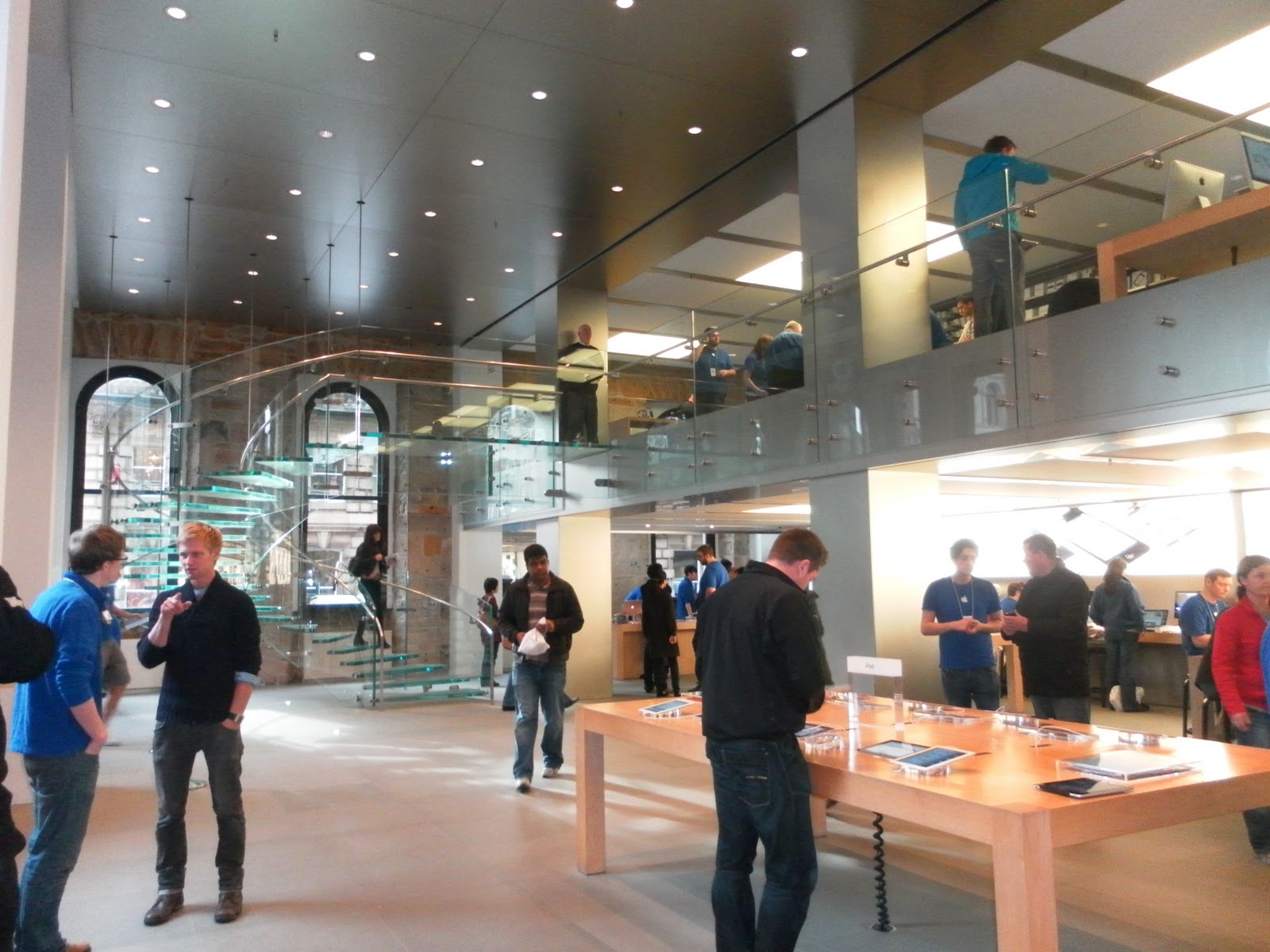
When walking down the rest of Buchanan Street, I made a point in visiting the Apple store.  It's clean slick interior makes me feel good every time.  The interior is minimalist, which really adds to the brand identity of the store.  The one thing I always notice when entering the apple store is the number of staff dispersed throughout the interior.  The combination of good customer service alongside the layout of the store, really does gives Apple it's positive brand identity.  They are inviting, and it's obvious.


I really enjoyed my day in Glasgow.  I particularly liked how Graven Images branded Merchant City.  It really does add a little something extra to Glasgow's thriving city centre.


Thursday, 10 November 2011

BLOCK 2: Forget about the product - it's all about the packaging!

We as consumers use products everyday, however we normally don't seem to take any notice of the packaging the products come in.

It's hard to believe that in some cases the packaging of a product can cost even more than the product itself.

With some of these products, their packaging cannot go unnoticed...

- Creative Japanese Pastry Packaging


- Note ear phones


- Fruit juice packaging


- Shoelace box


- Anti-theft lunch bags
(absolutely loving this idea)


- Butter knife

What can we take from these examples?

Well its seems from a marketing perspective that it would be cheaper to spend your money on a good industrial designer than spend money on a good product in awful packaging (and end up not selling it..)

BLOCK 2: Minimalist Effect in the Maximalist Market

In the world today it seems that the best ideas, whether it's for a business, a company or for design, are so simple that you wonder how you didn't think them up yourself.


Leonardo da Vinci once said: ''Simplicity is the ultimate sophistication.''


500 years later and da Vinci's words are still relevant today.  His rule is still successfully used in design and advertising.  It's important to realise that simple things often require more brain power to create than the more complicated things.


One of most simplistic ads i've seen is the following advert for kit-kat..


there is also one for Heinz tomato ketchup..


I also found a number of other adverts focusing on  increasing the simplicity of their packaging.

Each example shows 
  • the original product
  • the simple variation of the product
  • the more simple variation of the product


In my opinion, less is definitely more.  I also think that some of these designs would save a number of companies a lot of money (reducing label printing costs).  I guess taking the minimalist approach would also help the environment by reducing the amount of labels/materials used in production.

Perhaps more existing products need some review for minimal feeling...?


University of Dundee - Brand Audit


A few years ago my friends and I were all faced with the tough choice of what we wanted to study, and where we wanted to study it.  I remember attending the 2008 UCAS convention in Belfast with my year group and spending the entire day looking through a series of prospectus' favouriting and eliminating universities based on their prospectus' alone...

Universities make it their intention to attract as many undergraduates/postgraduates as possible.  They do this by producing a prospectus that not only informs you of the courses it has to offer, but emphasizes the benefits of the university in an attempt to compete with all the other universities, particularly throughout the UK.

In order to 'catch the eye' of those who are currently looking for a university education, universities need to know what to include on the front cover of their prospectus and what content they need to incorporate within their prospectus.

To determine how well the 'University of Dundee' is branded, I got together with a friend and carried out a brand audit.

We began by collecting a number of different university resources around the campus including the most recent undergraduate and postgraduate prospectus' and information on student services.


When looking through the resources together we noticed that the University of Dundee logo is present on each resource.  The continuity of the logo brings all the information together.  As the university campus is located within the city centre, the continuity of the logo throughout the campus also acts as a way of defining the periphery of the university.


When looking at the front cover of the prospectus in more detail, we came to the agreement that it could be better.


The image shows a group of students huddled together which undoubtedly illustrates a sense of community within the group.  However it doesn't actually inform the student target audience of what the University of Dundee looks like, nor does it show what Dundee as a city looks like.  First impressions are crucial - if a potential student who is unfamiliar with Dundee is not exposed to an image of the university or the city right from the start,  their interest may be lost as they may struggle to visualize making a life for them self there.

I personally feel that the front cover of the 2010/2011 postgraduate prospectus had a more appropriate image on the front of it.  It at least pin pointed a location.


Within this years prospectus there is a picture that is incredibly eye-catching.  It's a pity that the image wasn't used as part of the front cover!


The picture is titled 'the perfect city for student life' and shows a spectacular view of Dundee from the law hill.  An image like this has the capability to encourage those seeking a university education to find out more about Dundee and the University of Dundee to discover what it has to offer them.

Something that stood out for us about the brand image of the University was the variety of colour used within the information leaflets and the prospectus.  The different colours visually represent everything the university has to offer.  The bright colours are appealing and undoubtedly eye-catching. 


The prospectus also mentions the V&A project that is planned to be completed in Dundee in 2013.  Linking the university to the art and cultural prospects that Dundee will have to offer at this time acts as another incentive to apply to the university -particularly art and design students!


As a whole, we think the university is branded relatively well.  It stands out from the crowd in terms of what it has to offer, which makes it one of the success stories of British higher education.




Wednesday, 9 November 2011

Regulating Advertising

In a recent lecture we looked at how adverts for alcohol are regulated.


Within the lecture, I soon realised that advertisements for alcohol are not allowed to be targeted at people under the age of 18, and they should not imply, condone or encourage immoderate, irresponsible or anti-social drinking.


With a rule like this to consider, companies really do need to think outside the box in order to create a successful advertising campaign for their alcoholic products.


Additionally, the advertisements must neither imply that alcohol can contribute to an individual's popularity or confidence, nor imply that alcohol can enhance personal qualities.  Marketing communications must also not link alcohol with seduction, sexual activity or sexual success nor imply that alcohol can enhance attractiveness.


If an advertisement breaks these rules, then the advert will be banned, whether its a 2d advert or a 3D audio visual advert.


The advert for Young's Bitter was the given example of an advertisement that was banned because of it's link between alcohol and sexual success.


The advert for Young's Bitter had the slogan, 'This is a Ram's World'.  The women in bikini's looking at the ram linked the beer with seduction, therefore giving the ASA (Advertising Standards Authority) reason to band the advert.

Another advert that was banned was the advert for the beer 'Courage' for its link between alcohol and 'alcohol driven' confidence.


The advert shows a nervous man with the slogan 'Take Courage my friend.''  The advert clearly suggests that beer could help boost the confidence of the man. This was the reason it was banned.

After the lecture, I made a point in researching other alcoholic advertisements that had been banned, and this is what I found: